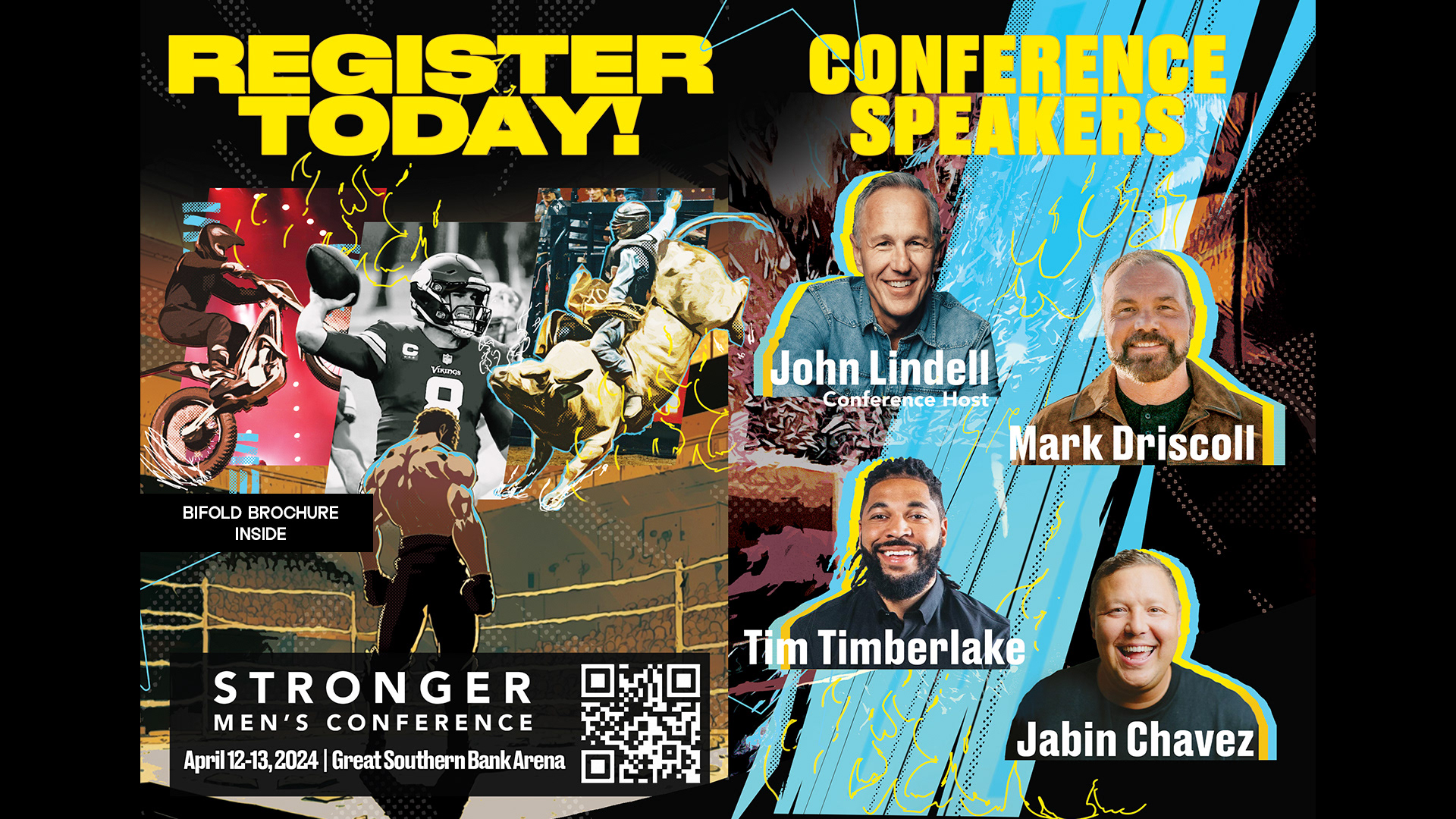
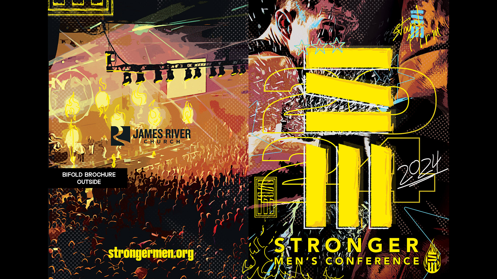
The Stronger Men’s Conference is a world-class event focused on calling men toward strength, responsibility, and purpose. The visual identity for the conference was designed to feel bold, unified, and confrontational in the best way—less promotional, more declarative.
Drawing from pop-culture heroes and comic-book aesthetics, the design uses strong typography, gritty textures, and high-contrast color to evoke resolve and momentum. The look and feel suggest something closer to a movement than a moment.
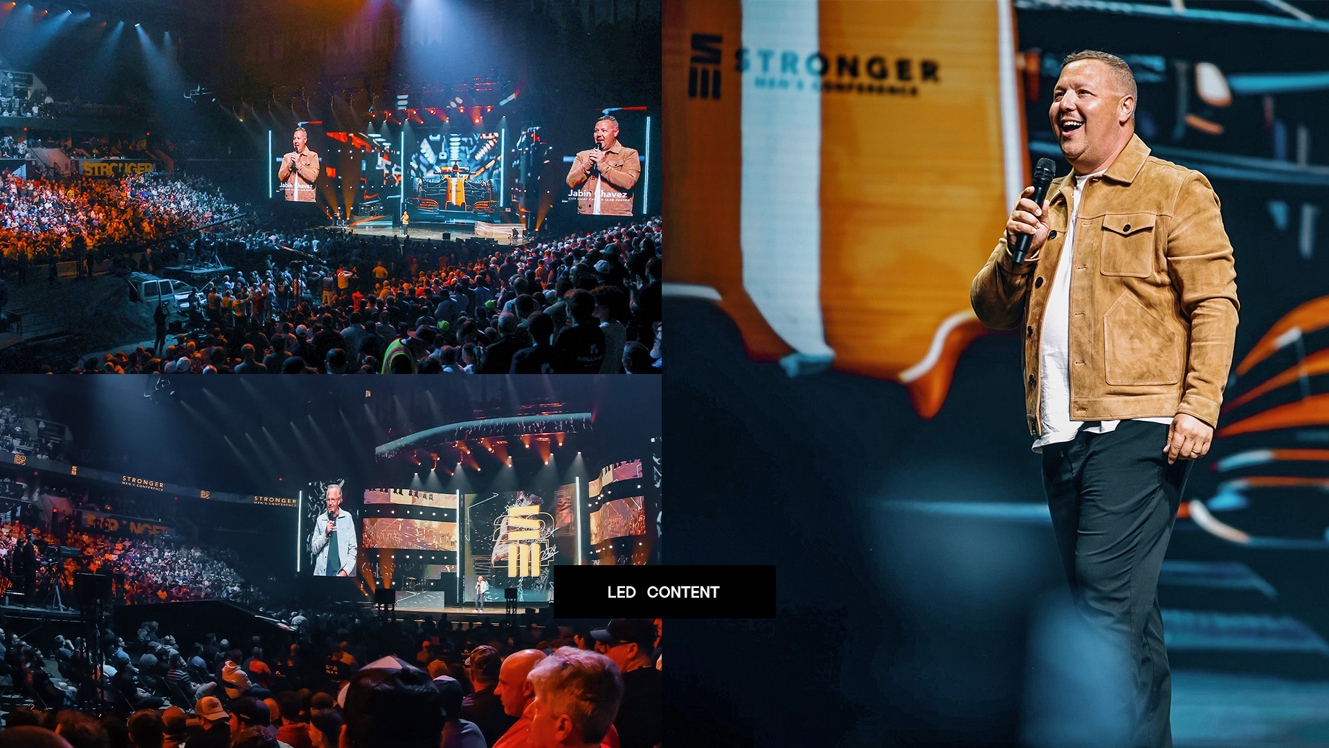
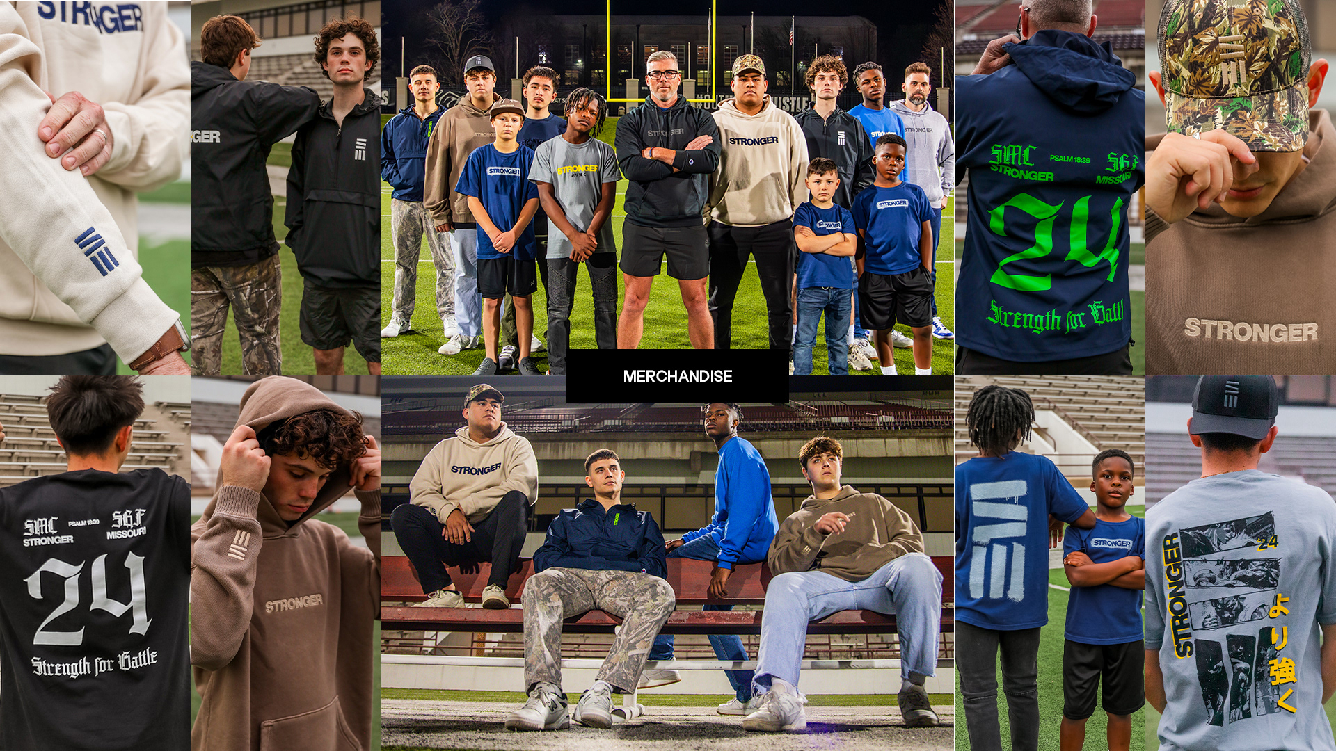
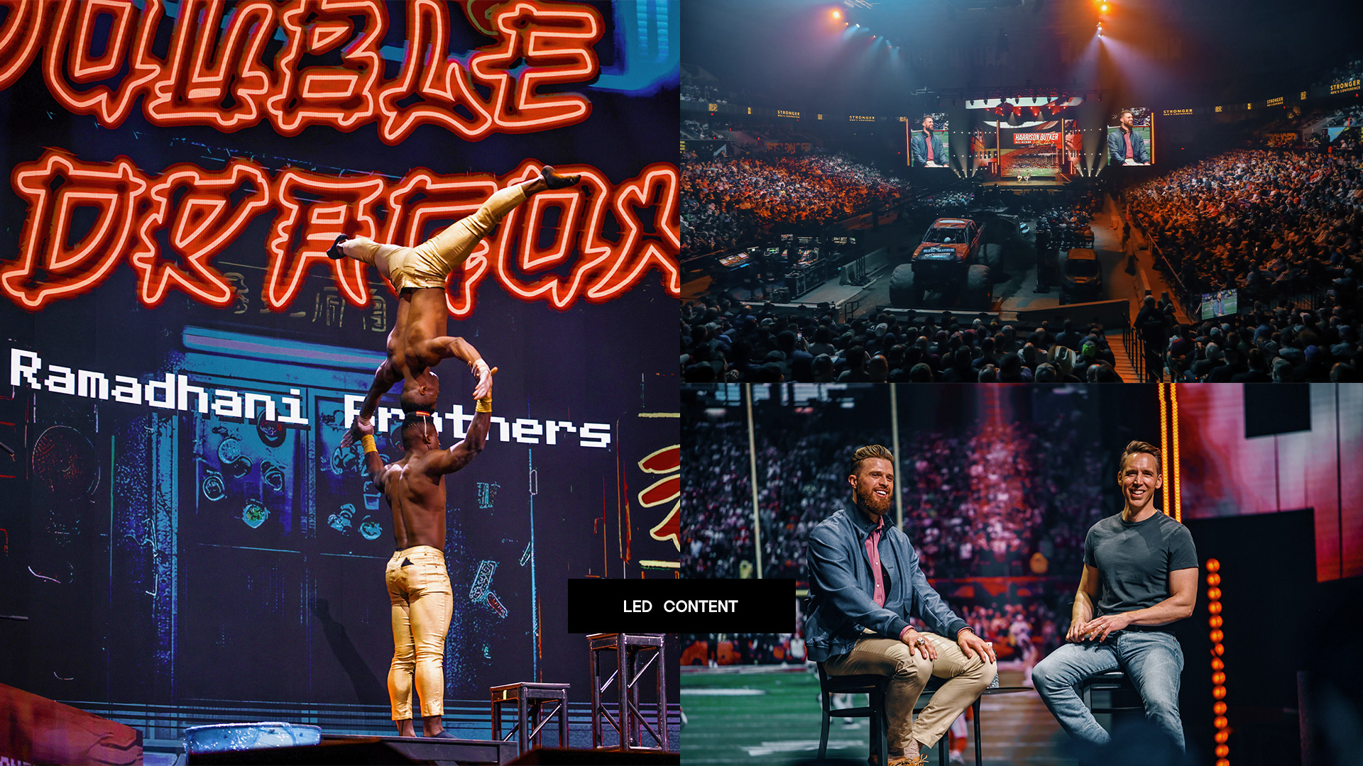
The system was applied across the full conference experience, including brochures, large-format banners, building decals, billboards, LED screen graphics, and a comprehensive digital advertising campaign. Every piece worked together to create a consistent presence before, during, and after the event.
The result was an environment that felt cohesive, intentional, and energized—supporting the message of the conference and inviting men to step into something bigger than themselves.